Learning About Dinosaurs Collection: A Palaeoart Horrorshow
Happy halloween season, reader!
Say, remember these books? It's easier if you were born and/or raised in the 90's or early 2000's, but to those born later then that, allow me to introduce them to you.
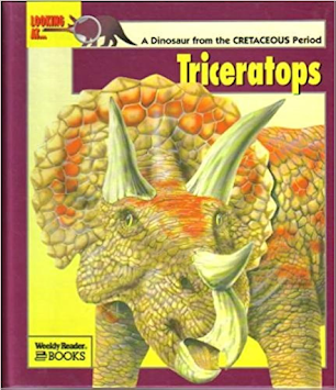


These are the Looking At... Dinosaurs books. They are all illustrated by Tony Gibbons, and written by a body that included authors Heather Amery, Tamara Green, Frances Freedman, Mike Brown, and Jenny Vaughn. Finally, Cambridge's David Norman was the consultant for the book series, while Gareth Stevens Publishing published the books; they also did other series like it, covering topics like animal victims of the Anthropocene Extinction and arthropods.
Each of the books follows a typical formula. There are a few deviations in order from book to book, but they mostly go:
- The introduction to the genus
- A size comparison spread
- A spread with the skeleton of the subject.
- An illustration of the dinosaur in its time.
- Two or three freespace pages that vary by subject, often seeming random as possible. For example, the book on Ouranosaurus has a spread on dragons, the only connection being that its sail make it kind of (and I stress that bit) look like dragons' wings.
- A comic strip of dinosaurs going about their lives.
- A portion called "*Subject* Data" highlighting it's subjects anatomy.
- A spread of the subject with relatives or those linked to it by one theme.
Why is this book series the designated Halloween review? Here is an example why.

Yeah, most of if not all the art by Gibbons for the books is real palaeoart freakshow, barely accurate nor plausible to the likely real thing. At a time where the lithe and fast depictions of dinosaur was starting to get entrenched thanks to a certain film series and the greater Dinosaur Rennaisance as a whole, these bloblike abominations seem to have come right out the Knightian and Burianian periods but even worse. The cartoonish stylisation Gibbons gives does not help either, with large eyes and overly-smooth scales that come out of the much better John Sibbick's fever dream.
The scariest bit is how the horror creeps up on you over the years. I barely thought anything wrong with each book when I was a kid, but now that I am a thinking adult I can see how horrific abominations they are. Keep in mind this was the 90's when the Internet wasn't as used much and books couldn't always be gotten quick, so people mostly relied on convenient memory - but the memories got distorted, and bam, instant uggo across the waxed paper.
And it's not just the dinosaurs here, Tony Gibbons' other afromentioned series are also apparently quite atrocious to look at, suggesting that he's a really mid if not terrible artist in general (no offense to you Tony, if you are reading this, but you really need to improve yourself).
All this is not getting into the inaccuracies. I don't even have to mention the featherlessness, pronated hands and upright stances that would break the pelvis and elephant feet, as well as a large absence of any sort of wattles or additional soft tissies. The last part is admittedly speculative, but that also means that the designs come off as very bland versus others of the time.
The colours for each dinosaur meanwhile range from bland uniform colour to decent, to really garish. A good example is the series' Muttaburrasaurus, wich is clad in dayglo patches of yellow among the blue. While none are bad, they do seem rather worse off when you think of others.

I admit for some, the designs do have the same charm as those hollow rubber toys known as Chinasaurs that barely resemble the real thing even back then, but I'm not exactly one of them.
Let's look at some of the worst artistic offenders in my.... book, shall we? Though I admit you might find even worse then even what I've seen.


I'm not a fan of the weird gaping mouths and wide eyes the sauropods have here, and the shape of the Camarasaurus' head being so wrong its not even funny.


A slightly better forward angle without references is this Dilophosaurus from its book.


The Chas,osaurus looks pretty bad the more you look at it.
But all that pales in comparison to something else. Behold, the worst of Tony Gibbons' art for the series.
 |
| *Howie Long scream* |
This. This is hideous. It gets worse the more you look at it. It looks almost like AI generated "art" the way some have extra appendages and how the dinosaurs look nothing realistic, which is horror all on it's own. Indeed, this very illustration inspired me to write the blog post in the first place. The cherry on top is that its from the Baryonyx book, but it's only connected by that small paragraph in the bottom right corner, so it just looks all the more alien and out of place.
There are a myriad of other problems with the series too.
- Bad designs aside, accuracy is often very low even for the 90's and 2000's. You have for example dinosaurs that didn't live with each other or at the same time doing so, like Allosaurus living with Chasmosaurus. I mean, What!? Did they get mixed up with Albertosaurus, which is also in the book!? Did anyone even proofread the book!?
- The skeletals, while seemingly good for the most part, do have obvious tracing, particularly of skulls, and lack gastralia which gives them an odd appearance, even if they are miles more easy on the eyes then the life restorations.
All that said, is there anything good about the Looking At series?

I admit the text can be decent and surprisingly in-depth, even mentioning specific museums and dates other books of its kind didn't, which adds something as a whole to the line. I find the human portions nicer then the dinosaur segments in fact, as they have a nice looser painted style that feels way more pleasing, if admittedly more like a carnival ride's backdrop then anything else. Unsprisingly they are by a different artist, I believe the artist to be Clare Herronneau (who is listed in the books' credits - is that even the correct term?), who likely deserved way better a career, maybe even be the main artist for the books.
There actually are a few decent artwork pieces in the series by Gibbons. This one from the Diplodocus book has some really nice perspective that shows off just how honking huge diplo was.

But otherwise, the series is quite mediocre.
- Accuracy - 5/10
- Aging - 4/10
- Artwork - 4/10
- Layout - 6/10
- Information - 6/10
- Rereadability - 5/10
The Learning About Dinosaurs Collection has aged quite poorly, especially in the palaeoart department with only a few redeeming elements to it; it's a definition of cheap nonfiction books with little effort put into the art and research (and if anything, the ones from today are even worse - at least Looking At has original artwork - today it's all traced Jurassic World renders and stock models). You can really only enjoy it ironically or nostalgically or for a completionist run of certain palaeobooks. Still, if you do actually like anything in the series, it's alright with me.
Special thanks to Internet Archive for providing me with the books. You can read them here for yourself. Tell me what you think are the nadir of the Looking At series.
Farewell! Enjoy your Halloween!
Sources/See Also
- Dinosaur Island (2002): A Film Review, last year's Halloween review.


Comments
Post a Comment